Week 6
Milestones
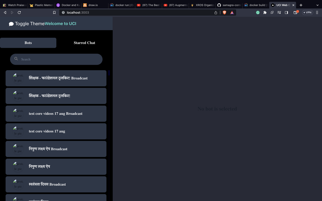
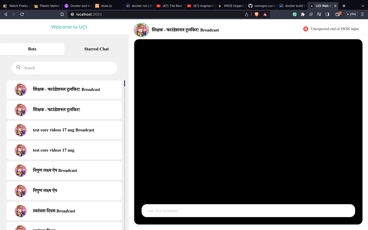
- Introduced a visually appealing and user-friendly dark mode to the application, enhancing user experience during low-light conditions.
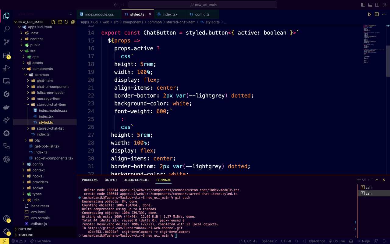
- Developed a set of global themes using styled-components, allowing consistent styling throughout the app and reducing the need for redundant CSS code.
- Fine-tuned the application's responsiveness across various devices, ensuring seamless usability and optimal layout regardless of screen size.
Screenshots / Videos
Contributions
- Leveraged styled-components' dynamic theming to toggle between light and dark modes, enhancing user comfort and accessibility.
- Crafted a unified design system by creating and applying global themes, resulting in cohesive and harmonious visuals across all app components
- Orchestrated a comprehensive overhaul of the app's visual identity, replacing ad hoc styling practices with the structured approach offered by styled-components, resulting in cleaner, more maintainable code.
Learnings
- Deepened knowledge of theming, utilizing styled-components' ThemeProvider to maintain a consistent design language
- Recognized the importance of dark mode in accommodating users' preferences and improving accessibility, aligning with modern design trends